Shaun is a product designer based in San Francisco, CA.
He's worked across agencies and early to mid-stage startups, usually when things are still taking shape.
Right now he's at Proof, a B2B legal-tech company, reimagining the client experience.
Overview
Proof helps law firms manage service of process, where documents are delivered by real people and assignments change often. When work moved between servers, clients couldn't tell what had happened or what was current.
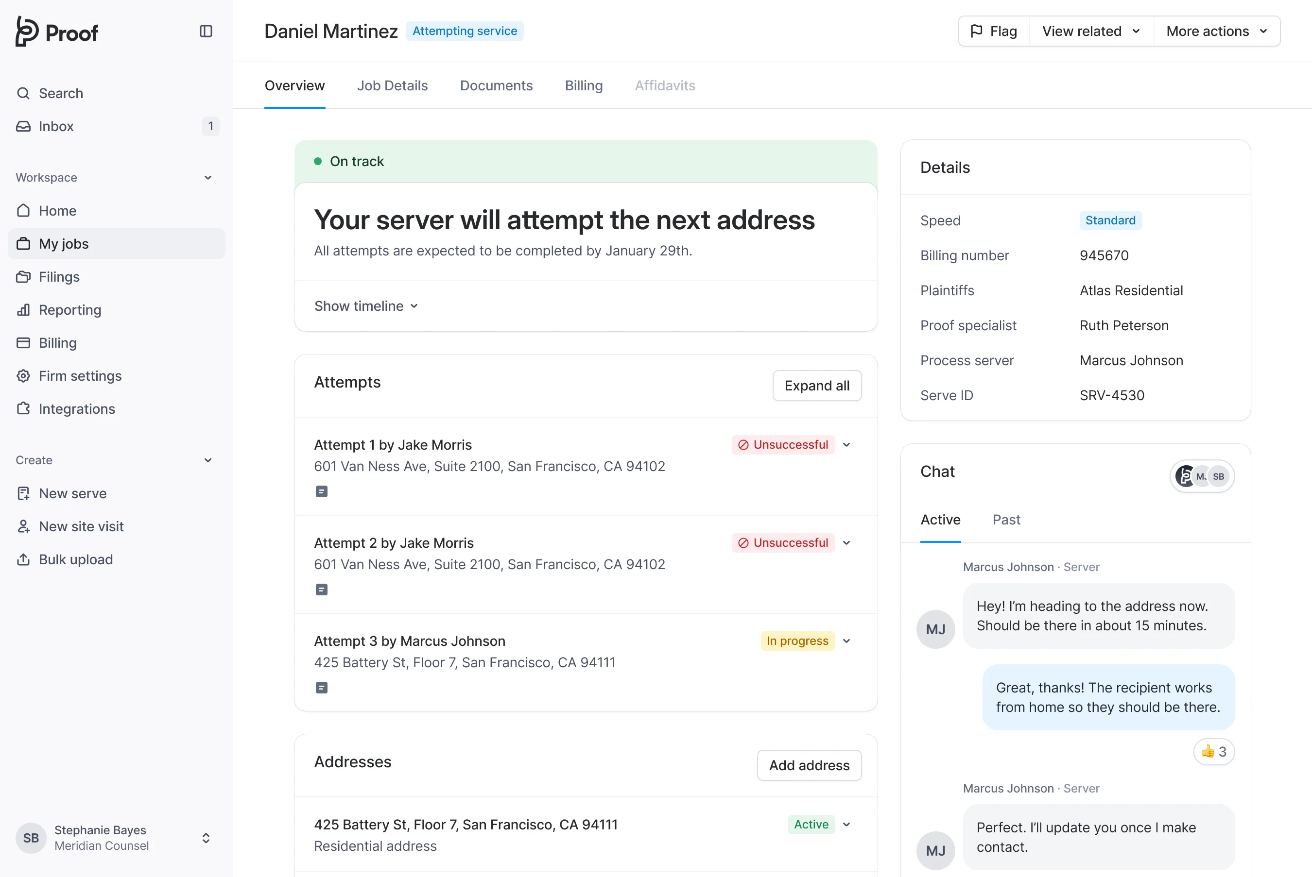
I owned the experience from early vision through final design execution, with special care put into designing the new serve tracker and chat widget.
Role
Lead Product Designer
Duration
July – Dec 2025
Collaborators
Design Manager
Product Manager
Design Systems
Tools
Figma
Cursor
Problems
Important information was split across multiple pages
When jobs got reassigned, the story reset and users were left in the dark.
Repeated questions flooded our Ops team with avoidable chats
30% of chats only existed because the product didn't make job status clear.
Any update on the serve?
Still working on it
It's been a week, what's going on?
Checking with the server now
Hello???
Core Flows
*Scaled down for mobile, better on desktop.
A timeline that tells the whole story
Clients see exactly where their serve stands, what's happened, and what comes next.
We tested close to a hundred scenarios: delays, reassignments, failed attempts, multiple addresses, and edge cases. The tracker handles all of them.
All your chats in one place
Every conversation from every job, past and present. No switching required.
Every attempt, documented and verifiable
Location, photos, and server notes for each visit. When questions come up, the answers are already there.
Multiple addresses, one clear view
Clients can add, approve, or reject service addresses in one place.
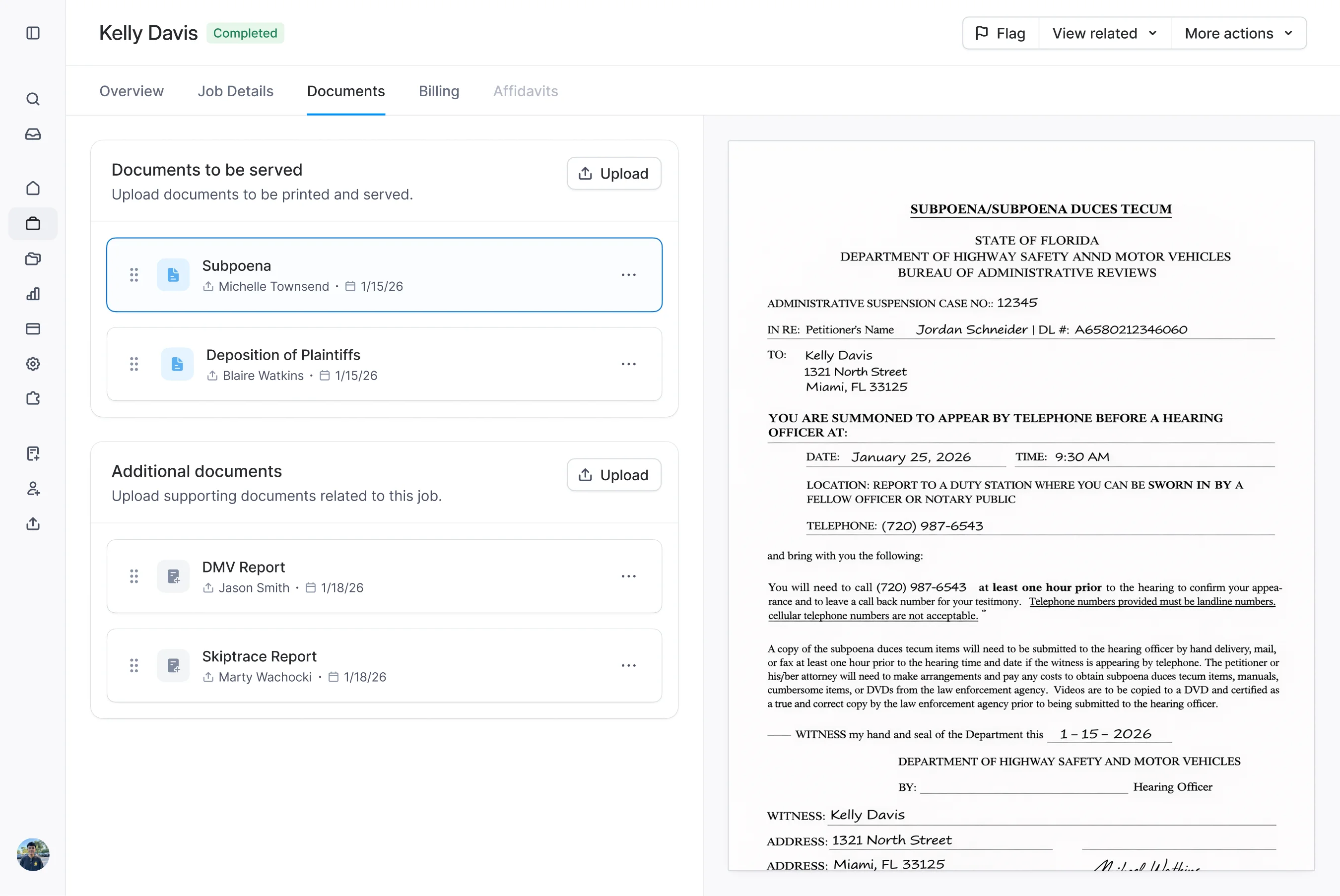
No more digging through emails for documents
Documents stay with the serve, even when jobs get reassigned or take unexpected turns.

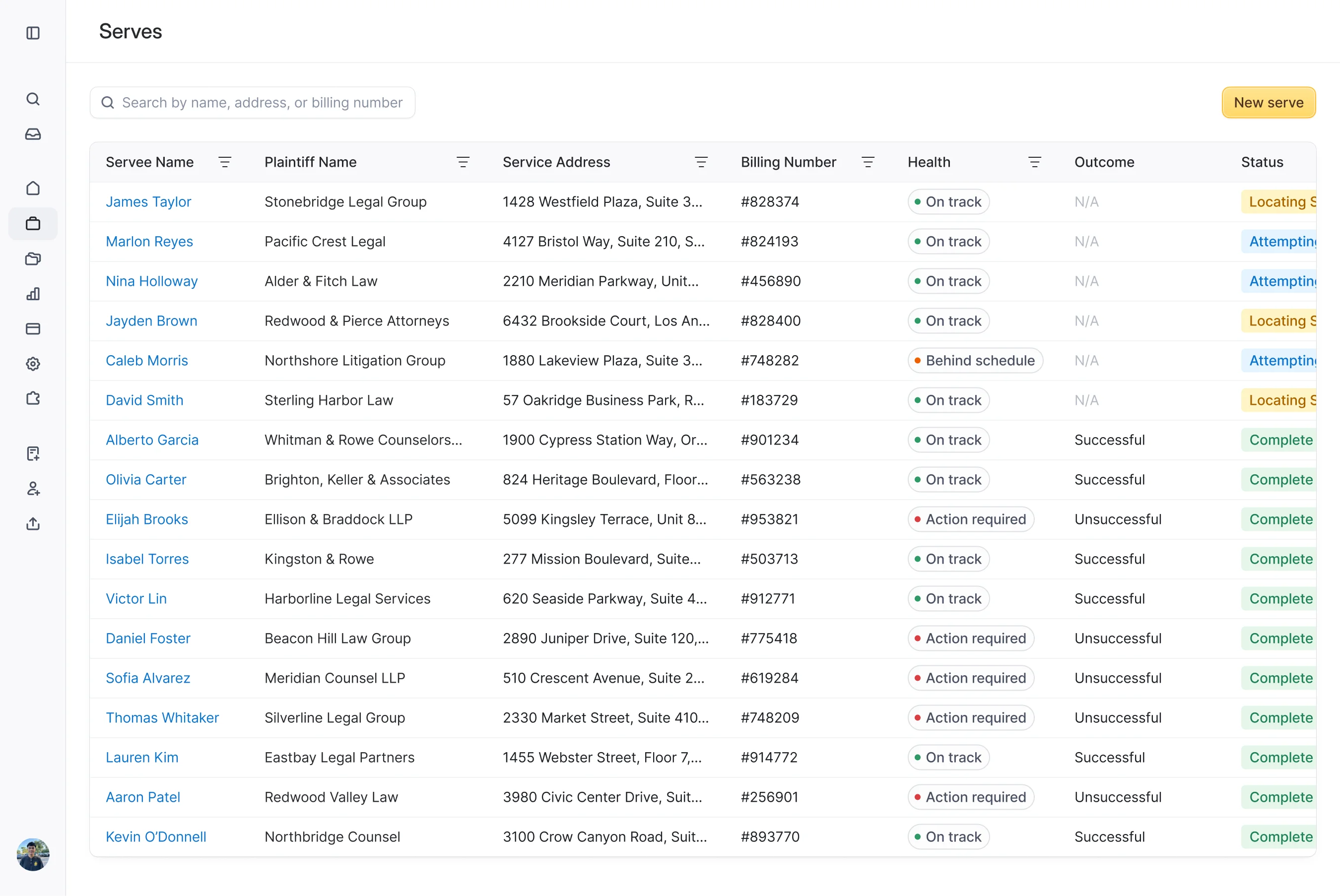
A bird's eye view of every job
Firms can see all their serves at a glance, with clear insight into how each one is progressing.
What we solved
Old data model
Every reassignment spawned a new job record, leaving clients unsure which page held the latest updates.
One serve, one story
All progress, messages, and history now live on a single page, even when the work gets reassigned behind the scenes.
The redesigned serve page brings everything into one place. Clients can track progress, view attempts, and access documents without asking for updates.
Reflection
The redesigned experience reduced confusion, lowered repeat support requests, and rebuilt trust. Clients gained a clearer understanding of job status and next steps, while internal teams aligned around a shared source of truth that made the experience easier to support and operate.
Less noise
25% fewer status checks
Full retention
100% pilot retention
Real usage
70% adoption
Overview
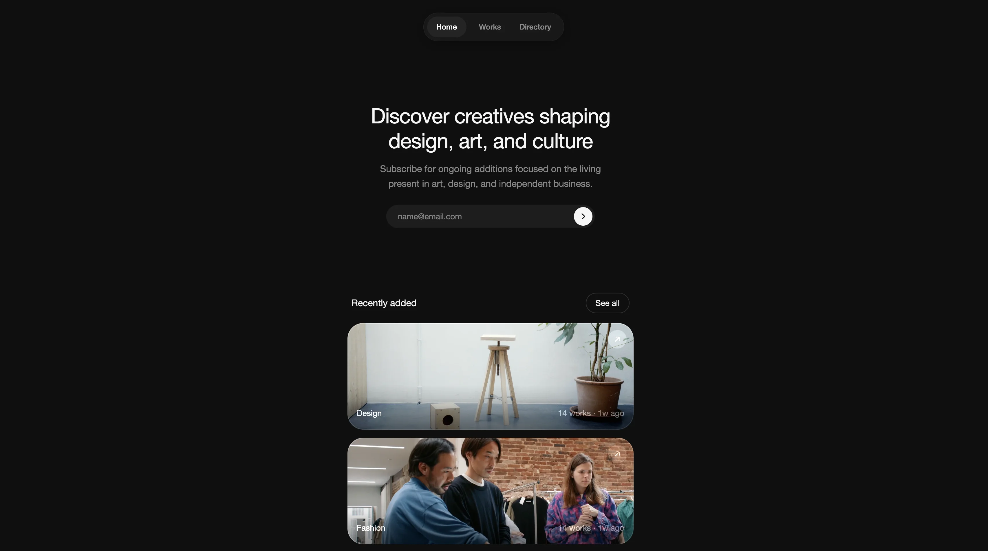
Creatives.wiki is a curated directory of designers, artists, and founders who are shaping culture today. It highlights people building independently, where work is often scattered and easy to miss.
I designed and built the entire site from scratch using Claude Code, treating it as a personal project to explore what a thoughtful creative directory could look like.
Role
Designer
Developer
Duration
3 weeks
Built with
Next.js
Sanity
Vercel
Tools
Claude Code
Figma
Explore
Selected independent projects by designers, artists, and founders.
Built around real projects
See releases in relation to the people who made them.
Related work
Discover other projects you might like from adjacent creatives.
Browse people
A quick way to browse the individuals behind the work.
Geography
I designed a globe view to give a sense of where creative work is concentrated around the world.
Profiles
Each profile pulls together the companies, projects, and interviews tied to one person.
Reflection
Coding with AI made it clear that if you can articulate what's in your head, you can design almost any interaction directly in code. Instead of translating ideas through layers of tooling, I was able to shape the product in real time and get it to look and feel exactly how I imagined it, down to the smallest interactions.
Performance, data modeling, security, and deployment also became things I had to consider for the first time end to end. Designing something entirely for myself removed the usual friction and allowed me to go deep into every shadow, hover state, micro-interaction and easing curve.
Overview
I spearheaded the design for a product that allows customers to invest in fractional shares of rental properties across the United States. This was a business critical and zero to one project.
As the sole designer at Concreit, I owned the entire design process from end to end. From research and ideation to user flows, prototyping, interaction design and visual design.
Role
Product Designer
Duration
2023 – 2024
Business Opportunity
Real estate in emerging markets was rapidly appreciating
Millions of renters meant predictable cash flow for long-term investors.
Single-family rental households (millions)
Traditional real estate was inaccessible
Fractional ownership opened real estate investing to everyday investors.
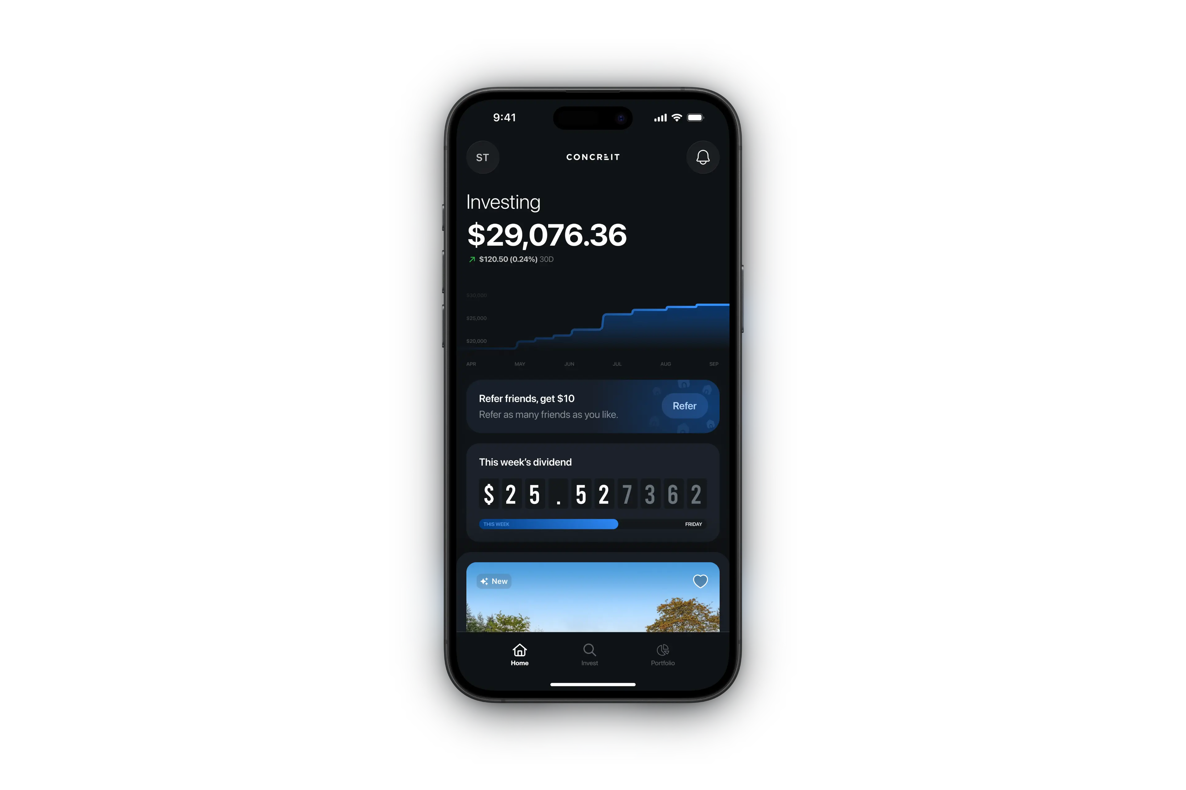
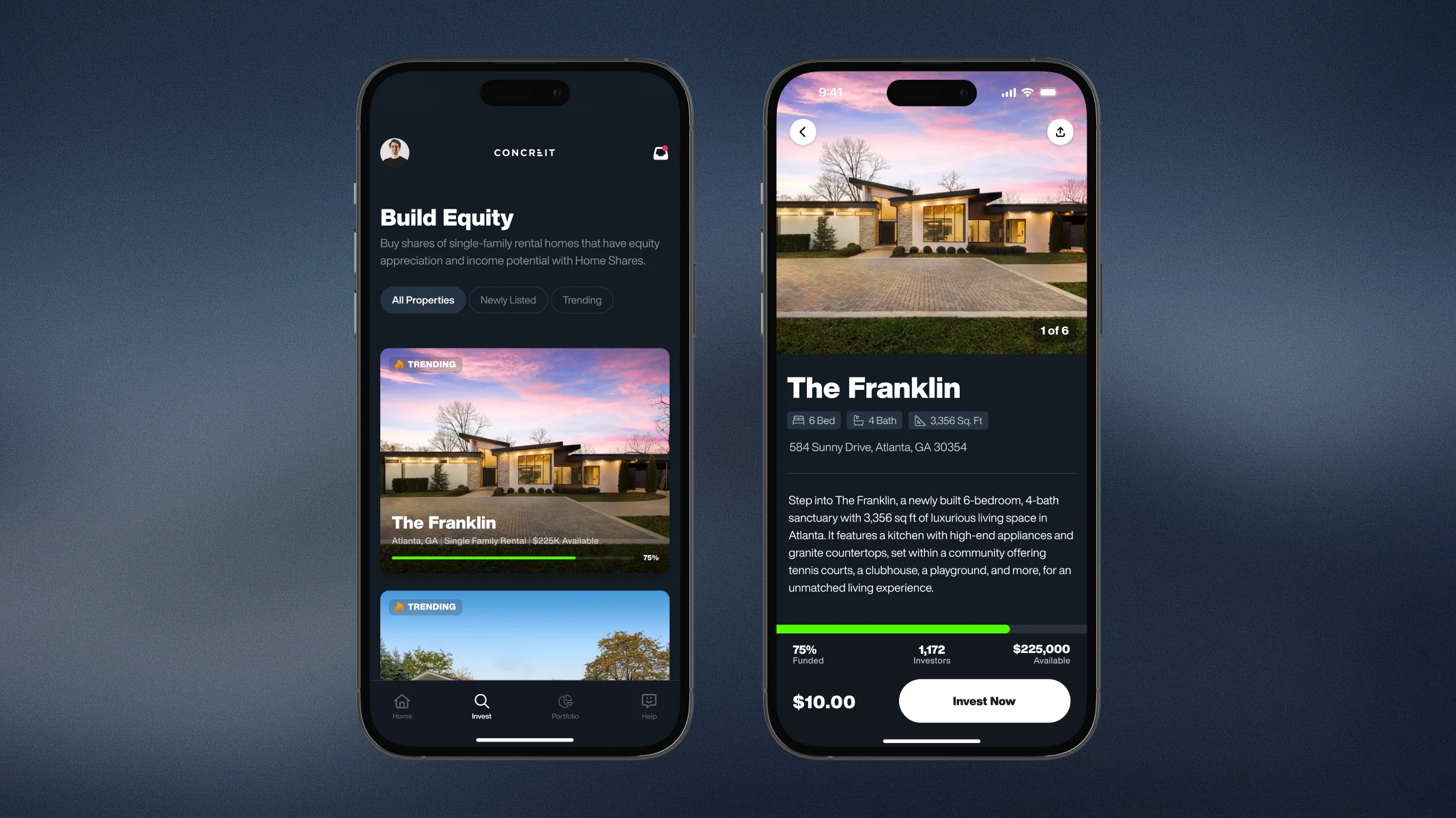
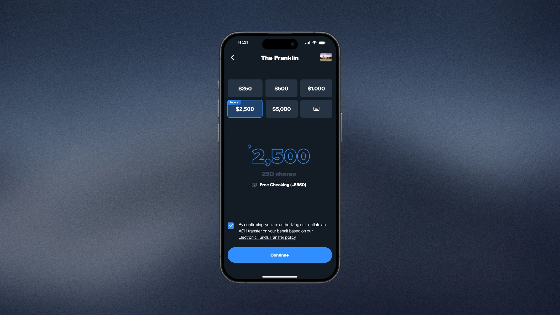
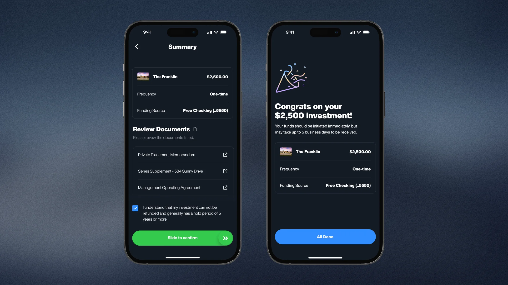
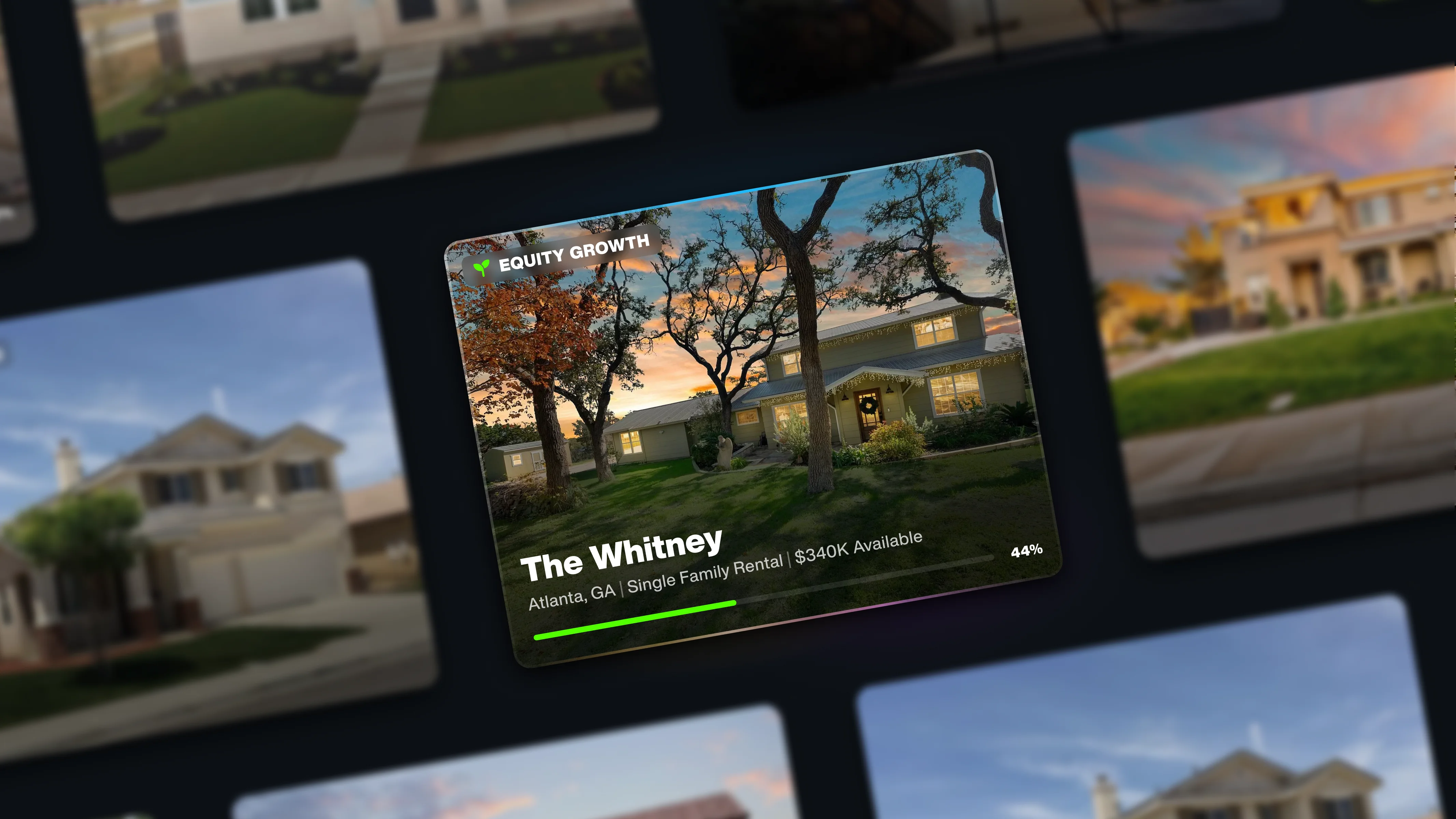
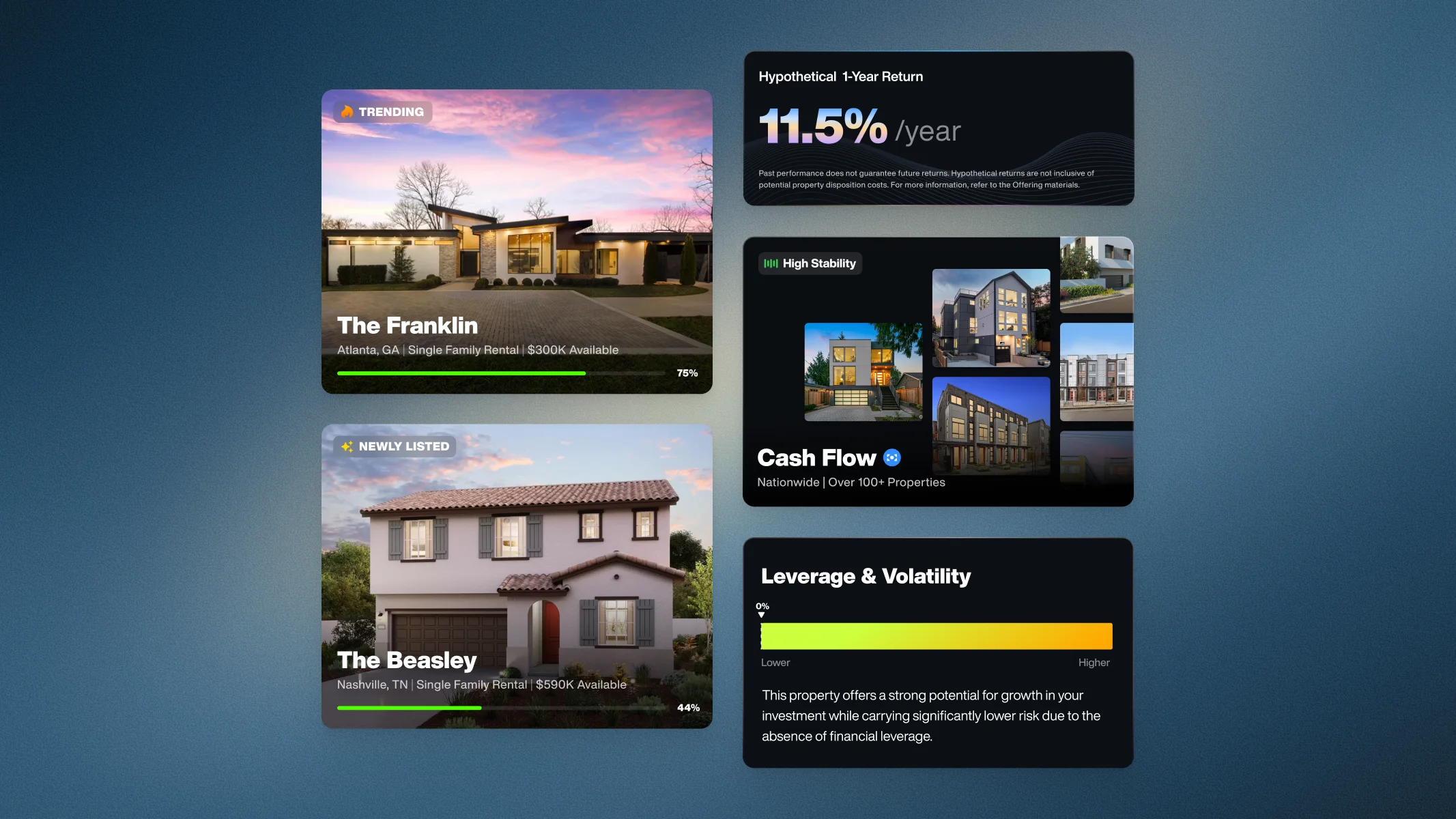
Invest in Real Estate
Buy fractional shares of rental properties across the US.
Reflection
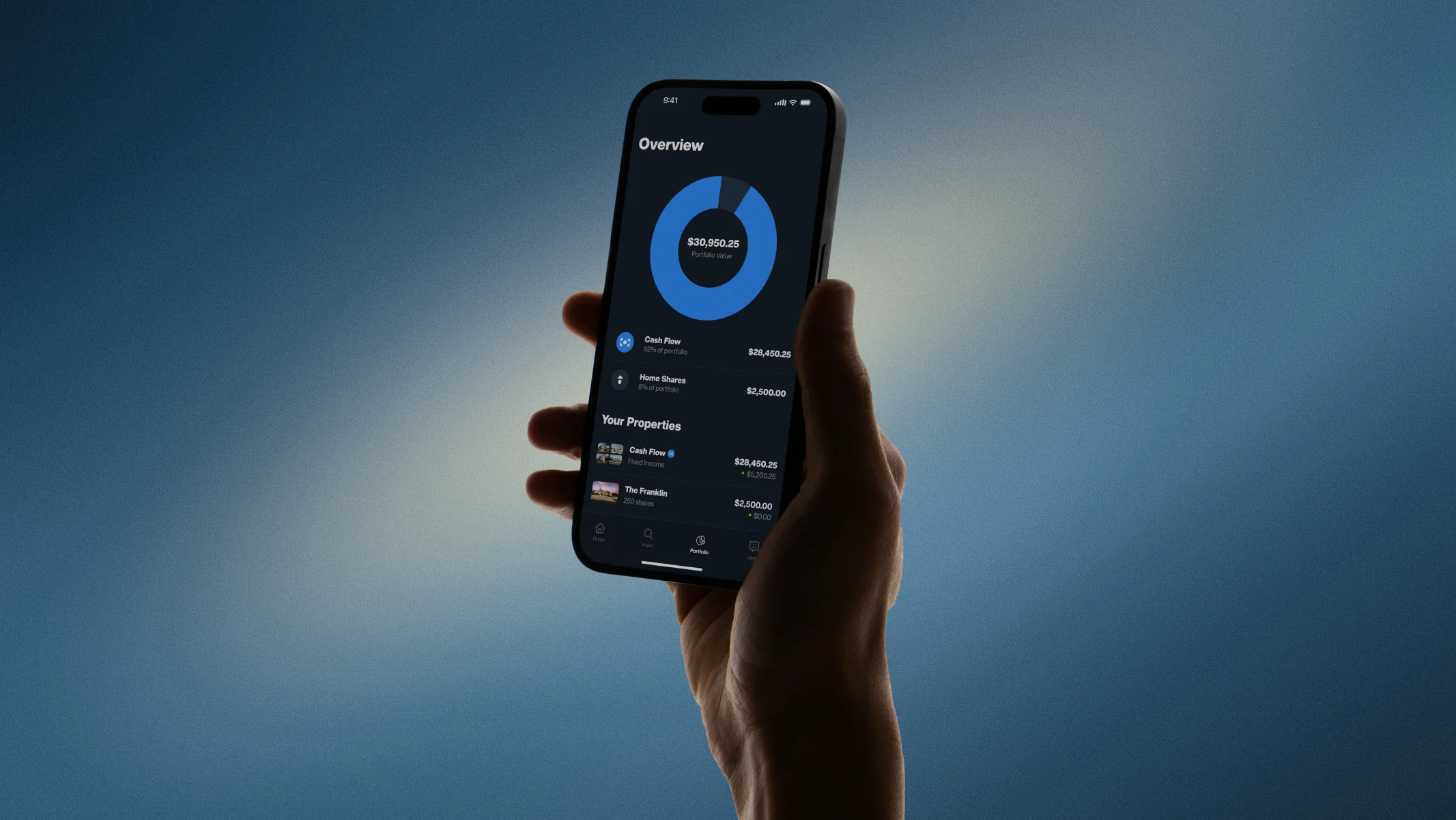
The Home Shares launch expanded Concreit beyond a single investment product. Members could easily invest in individual homes, combining ownership and income in a way that felt clear and approachable. The redesigned dashboard and flows helped users understand their investments at a glance and move confidently from discovery to action, driving strong adoption and higher investment amounts.
Revenue generated
$1.2M+
Larger investments
$1,167 avg (11× increase)
Rating improved
4.2★ from 3.8